In this tutorial, you'll learn how to create basic Android image controls. Then you'll learn how to configure, style, and manipulate these controls in a variety of ways.
This tutorial shows you the steps to create a number of different ImageView controls in your Android application. First, you learn how to add basic image controls to your layout files and what some of their most useful attributes are. Next, you learn how to set the image control’s contents in several different ways. Finally, we discuss some of the other features available to ImageView control in Android.
The Android SDK includes a simple static text control for use within your layouts: ImageView (android.widget.ImageView). A good example of ImageView control usage would be to display an icon or graphic on the screen. ImageView controls can be bitmap graphics ( such as PNG, JPG, and GIF) or they can be other, Drawable types that are supported by the Android platform, like shapes defined in XML.
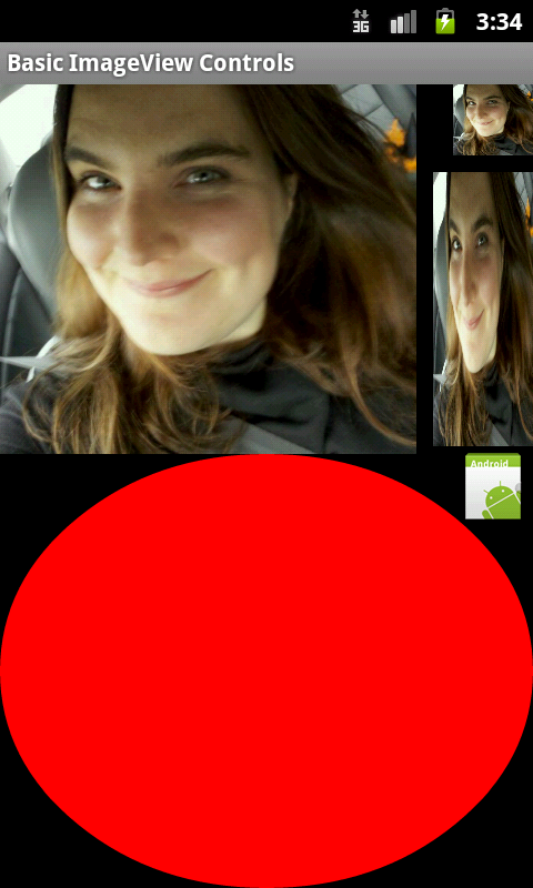
Here is an example of a screen with five different ImageView controls displayed on it.
Step 1: Create an Android Application
Begin by creating an Android project. Implement your Android application as normal. Once you have a project set up and the application running, decide under which screen you want to add ImageView controls to. Perhaps you’ve simply created a new Android project with its default Activity and layout (main.xml). This will work for this exercise. Once you have gotten your Android project set up, you are ready to proceed with this tutorial.
Step 2: Adding an ImageView Control to a Layout
ImageView controls are usually included as part of your Activity’s layout resource file. For example, to add an ImageView control to the main.xml layout resource associated with your application, you must edit the layout file. You can do this within Eclipse using the Layout Resource designer, or by editing the XML directly. Controls can also be created programmatically and added to your screen at runtime. Simply create an ImageView control (android.widget.ImageView) and add it to your layout within your Activity.
To add an ImageView control to a layout resource file, open the /res/layout/main.xml layout file that is part of your Android project. Click on the LinearLayout (or parent layout control) that you wish to add the ImageView control to. In Eclipse from within the graphical Layout Resource designer, you can select the ImageView control from the Images & Media section of the Palette and drag it into the parent layout.
To configure how the ImageView control looks and behaves, adjust the control’s attributes by selecting the control (either in the Outline tab or the Preview window) and changing its attributes in the Properties Tab. You can also edit the XML directly.
Specific attributes of ImageView controls you will want to be aware of:
- Give the ImageView control a unique name using the id property so it can be referenced by other controls in the layout XML and programmatically from your Java code.
- When working with layouts and drawable resources, set the image displayed within the ImageView control using the src property; this can be programmatically set with the setImageResource() method, or there are other ways to load images from other sources, like setImageBitmap, setImageDrawable(), and setImageUri(), depending on where the graphic originates.
- Set the layout height and layout width properties of the control as appropriate, as usual.
- Set any other attributes you desire to adjust the control’s appearance. For example, adjust the padding, visibility or other settings.
For example, here is the basic XML found in a layout file for ImageView:
<ImageView
    android:id="@+id/imageViewOfGirl"
    android:src="@drawable/person"
    android:layout_width="wrap_content"
    android:layout_height="wrap_content"</ImageView>
Finally, if and when you want to access an ImageView programmatically within your Activity class, simply use its identifier to load it:
ImageView img = (ImageView) findViewById(R.id.imageViewOfGirl);
Now let’s discuss some of the most common attributes for ImageView controls.
Step 3: Sizing ImageView Controls
By default, contents of an ImageView control are of a certain size-usually the size of the graphic dimensions. They are also bounded by their layout_width and layout_height attributes. You can also specify minimum and maximum height and width attributes using a dimension resource (dp, px, etc.) For more information on dimensions, see the Android SDK documentation on Resource Dimensions.
In XML, these properties would appear within your ImageView control as:
android:minHeight="50dp"
android:minWidth="50dp"
android:maxHeight="150dp"
android:maxWidth="150dp"
Here we are specifying that the control should have a specific minimum and maximum size. Note that when used alone, specifying these sizes does not preserve the aspect ratio of the image, and therefore it can look squished, squashed, or otherwise not ideal.
If you’re working with ImageView control’s in your Java code, you can also set the min and max sizes of your ImageView control programmatically using the setMinimumHeight(), setMaxHeight(), setMinimumWidth(), and setMaxWidth() methods of the ImageView class.
Step 3: Scaling Graphics in ImageView Controls
When you resize an ImageView control, whether you’re looking to scale up or down, you often want to preserve its aspect ratio, or width to height relative dimensions so that the image looks right. The figure above shows several ImageView controls displaying exactly the same image of a girl, only with different widths, heights, and aspect ratios.
You can specify that the ImageView control preserve its aspect ratio using the adjustViewBounds attribute. In XML, this property would appear within your ImageView control as:
android:adjustViewBounds="true"
This attribute is most frequently combined with the type of scaling you wish to achieve. The simplest and most common scale type you’ll use is the fitXY type, which scales both the height and the width up or down until it fits within the maximum dimensions specified. Keep in mind that this does not mean that the control will be the EXACT max/min dimensions of those dimensions unless they map to exactly the same aspect ratio.
android:scaleType="fitXY"
If you’re working with ImageView control’s in your Java code, you can also set the view bounds and scale type of your ImageView control programmatically using the setAdjustViewBounds() and setScaleType() methods of the ImageView class.
Step 5: Handling ImageView Control Clicks
Like any other view control, an ImageView can be enabled for clicking, should you so choose. This ability is turned off by default in an ImageView. Turning it on is simple, though. Simply enable clicking of the ImageView using the clickable attribute, and then specify your click handler with the onClick attribute, like this:
android:clickable="true"
android:onClick="onClickGirl"
Then you’ll need to update your Activity class and implement the onClickGirl method, like this:
 public void onClickGirl(View view)
 {
    Toast.makeText(this, "You clicked me!", Toast.LENGTH_SHORT).show();
 }
ImageView controls also support long-clicks, but you’ll need to register for those programmatically. You can also make an ImageView focusable and enable or disable haptic feedback, should you so choose.
Step 7: Optimizing Graphics for Use in ImageView Controls
Generally, you want to provide mobile graphics assets that are sized appropriately for the types of devices you want to target. Here are some different scenarios:
- If you’re storing graphics as project resources, you might want to consider providing alternative versions for different screen sizes or resolutions (see the Android SDK on Alternative Resources for more information about resource qualifiers).
- If you need a simple graphic that stretches to different sizes, then you might look at NinePatch graphics.
- If the graphics you are displaying are coming from a third party, you may have less control over the size. You’ve still got options: you can scale them down on-the-fly as discussed earlier, or you can use the Bitmap class to physically create a n actual graphic that is sized the way you wish it, and then display it.
Step 5: Making Your ImageView Controls Accessible
Android apps are used by many different kinds of users. Accessibility is something to consider when you’re writing your apps—how will someone with limited or no vision work with your app? One easy technique that goes a long way towards supporting the built-in screen readers and other accessibility features of Android is to always, always, always set the content description for each graphical element on your screen—ImageView controls most of all:
android:contentDescription="Picture of a girl"
By setting the content description, even those who cannot see the girl in the picture will know that there is one, and can supply one with their imagination.
You can also set this field programmatically using the setContentDescription() method.
Conclusion
ImageView controls are commonly used in Android application user interfaces to display graphical (Drawable) contents in different ways. In this tutorial, you learned how to create Android image controls and customize them in a variety of simple ways. These attributes can be mixed and matched to allow for very flexible image display on the screen.

Comments