We are learning how to develop Android apps in this series. So far, we've looked at the structure of an Android app and explored user interfaces. In this tutorial, we will learn to work with the project resources.
Introduction
In this part of the series, we will examine the resource types you will most likely use in your first projects. Project resources include the layouts, images, and data values used within the app. When you create a new project, a few folders for common resource types are included in your project directory automatically. You can add folders for additional types should you need them.
You can find the resources for the project we created earlier in the series by browsing to the "res" folder in the Package Explorer. Expand the folder to see its contents. You can add new folders to the resources directory and can add new files to each one, as well as work with the existing files (as we did with the layout and strings values files earlier in this series).
1. Alternative Resources
Before we start with the specifics, it's worth noting that you can place your Android resources into two categories: resources that can be used across devices and resources that are tailored to a subset of devices. You can see an example of this in the existing project structure. In the Eclipse Package Explorer, look at the "res" directory. Remember that the different drawable folders are tailored to specific device screen densities. We will add one in this tutorial for drawable files that are not targeted (ones that can be used across devices).
You can add alternative directories for each resource type using qualifiers to target categories, as Eclipse has done with "drawable-hdpi", "drawable-xhdpi", and so on. The Android platform supports such qualifiers for various aspects of the user device, including screen size, density, API level, language, region, and more. Any resource type folder that does not include a qualifier in the name is for resources that can be used across devices. You will not always need qualified folders for all of your resource types, but when you test your apps on different devices you may find that some aspects need tweaking to remain usable across configurations.
2. Drawables
Step 1
As we know, Eclipse creates multiple drawable folders, each targeted at a particular density bucket. The drawable folders contain any images you use in your app. You can include images prepared outside of Eclipse in digital formats, such as JPEG, PNG, and GIF. You can also define drawables in XML code. Let's do this and add one to the main layout.
Although you should generally try to tailor your drawables to each target density, for the purposes of this tutorial we will use a single drawable for all devices. With the "res" folder selected in the Eclipse Package Explorer, create a new folder by choosing "File" or right-clicking the folder, then select "New" and "Folder". Give the folder the name "drawable" and click "Finish" to create it.
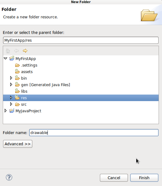
This is the process to follow any time you need to create a new folder in your project.
Step 2
Your new drawable folder should now appear in the Packager Explorer alongside the existing drawable folders. As we explored above, if a folder is not targeted to a particular subset of devices, e.g. defined using density categories or API levels (such as the values folders), you can place resources within in it that can be used on any user device. So whatever we place in the new drawable folder is displayed on all user devices. For most drawables you should prepare specific versions for different densities, but for simplicity we will use the new folder in this tutorial.
Create a new file in your new drawable folder by selecting it in the Package Explorer, right-clicking or choosing "File", then choosing "New" and "Android XML File". You will see a wizard to create the new file. Android supports a few different types of drawable files. We are going to create a shape drawable in which we define an image using markup to represent the different aspects of its shape and appearance. See the Developer Guide for an overview of the other drawable types.
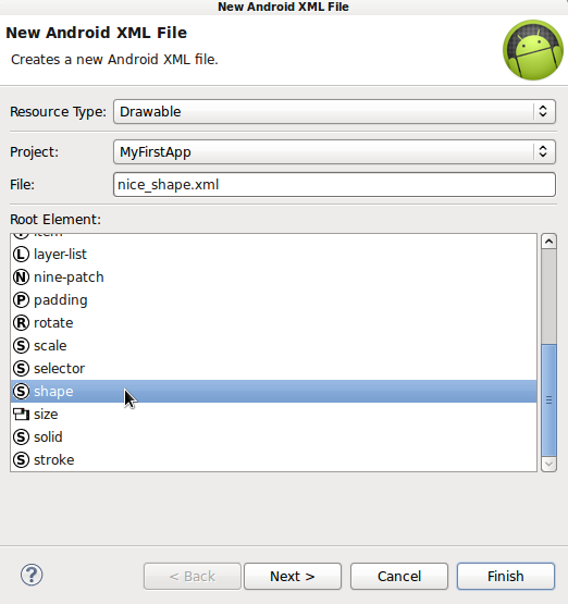
In the top drop-down list you can choose the type of resource, which is automatically selected for drawable since we are creating the file in that folder. Next is the project drop-down list, which should also be automatically populated with the project you selected. Next is a text-field for the file-name - enter "nice_shape.xml". Below that is a list of root elements you can choose. Scroll down and choose "shape" since we are going to define a shape drawable. Click "Finish". Eclipse will create the new file and open it for editing.
Step 3
With a shape drawable, you can choose from a range of generic shape types, including rectangle, oval, line, and ring. Once you choose a shape type, you can then define properties of the shape including solid or gradient colors, corners, padding, dimensions, and strokes. Edit your root shape element to choose a rectangle:
<shape xmlns:android="http://schemas.android.com/apk/res/android"
	android:shape="rectangle" >

</shape>
You can then define the shape properties by adding other elements inside the root shape element. Start by defining a gradient:
<shape xmlns:android="http://schemas.android.com/apk/res/android"
	android:shape="rectangle" >

	<gradient
		android:angle="270"
		android:centerColor="#FFFFFF00"
		android:endColor="#FF0000FF"
		android:startColor="#FFFF0000"
		android:type="linear" />

</shape>
We define the gradient type, angle, and start, end, and center colors. After the gradient element, let's add some rounded corners:
<corners android:radius="10dp" />
Next add a stroke:
<stroke
	android:width="2dp"
	android:color="#FF339966" />
When you type in the editor, you will see the available element and attribute types in the Eclipse prompts, so take some time to experiment with them after you complete this tutorial. We will use the shape in our UI in the next step. Save your drawable file for the moment.
3. Layouts
Step 1
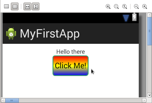
We started looking at layouts earlier in the series, when we designed the app user interface. Let's see how the layout file and drawables interact. We can display a drawable in the layout as the background of a View or within a dedicated View. Start by listing the shape drawable we created as background for an existing View. Open your app's main layout file. Let's set the shape drawable as background for the button we added. Add the following attribute to your Button element:
android:background="@drawable/nice_shape"
We use the resource type and name (the file-name we gave the drawable) to refer to it in the layout. Notice that this is the same syntax pattern we used when referring to string values. Save and switch to the Graphical Layout tab to see the shape as button background. You may notice that the button needs a little padding, so switch back to XML editing and add a padding attribute to the Button element:
android:padding="5dp"
Switch back to the Graphical Layout to see the effect.
Step 2
Now let's use the shape drawable in a dedicated View. Add the following after the Button element in your layout:
<ImageView
	android:layout_width="fill_parent"
	android:layout_height="fill_parent"
	android:layout_margin="10dp"
	android:src="@drawable/nice_shape" />
We set the ImageView to fill the available space minus a margin. You can optionally set it to use a fixed width and height. Notice that Eclipse displays a warning because you have not added a content description attribute, this helps accessibility so let's add one. Open your "res/values" strings XML file and add the following:
<string name="pic">Picture</string>
Now you can add the string to the ImageView in your layout file:
android:contentDescription="@string/pic"
As you can see, working with resources involves switching back and forth between various files in the project and using standard syntax patterns to make references between the resource items. Toggle again to view the graphical preview.
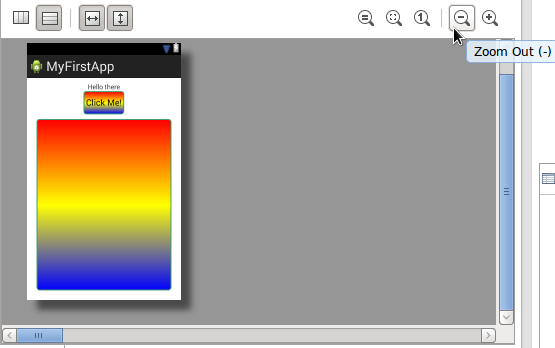
You can use the controls to zoom in and out.
4. Other Resource Types
So far we used three resource types in the app: layout, drawable, and values. There's more you can use in your apps, using the same process we used above to reference them. As we saw earlier in the series, you can also reference resources in your Java files using the following syntax:
//R.type.name
R.string.pic//example
Let's briefly summarize some of the other resource types you may find useful in future apps. We used drawable and layout resources above and in previous tutorials, and used string values in the layout file. Expand the "values" folder in the Package Explorer. Alongside the strings file, Eclipse typically adds one for dimensions and one for styles. In the styles file you can define coherent appearance properties for your app UIs. In the "dimens" file you can define dimension values you wish to use in your apps.
As we mentioned above, you can create alternative resource type folders using qualifiers for particular device properties. As you can see Eclipse creates values folders targeted at particular API levels, but you can target devices using many other qualifiers. For example, you may want to use fixed width and height for the ImageView we added, tailoring the displayed size to device screen size. To achieve this, you could add values folders for each size or density bucket ("-small", "-large", "-hdpi", "-mdpi", etc), with a dimensions file in each. By including a dimensions value in each of these files, giving the value the same name but a different number, Android automatically picks the correct one for the user device.
Other resource types you may find useful include those for numbers, menus, animation, and color values. Eclipse normally creates a menu folder when you create an app, so have a look in it now. To define XML animations, you can add an "anim" or "animator" folder to "res", or add your animation files to the drawable folders depending on the type you use.
If you want to use a set of colors across your app UI, you can define them in a file saved in the values directory, using the color element. Each color element can contain a HEX value and a name attribute, so that you can refer to the color in your other files. XML resources that do not fall under one of the defined categories on Android can be saved in an "xml" directory in "res".
For an overview of all of the resource types on Android, see the Developer Guide sections on Resource Types and More Resource Types. Although your needs will be fairly straightforward at first, it's worth looking through the list now so that you have an idea of what's possible later on.
Conclusion
In this tutorial, we looked at the basics of app resources on Android. But as you have seen, there is much more to explore. For your first few apps you can keep things relatively simple as you get accustomed to the practice of using resources. But as your apps develop, you should try to think about the variety of user devices your apps may run on, providing additional resources as necessary. In the next part of the series, we will look at the project Manifest file.

Comments