Apple has been pushing developers to create universal iOS applications for some time now. At WWDC 12, Auto Layout was released for iOS and improvements followed for it in iOS 7. And now with iOS 8, adaptive design has been introduced, which includes several new APIs and Interface Builder advancements to promote developing universal binaries.
In this tutorial, we will look at what exactly adaptive design means and how to use some of its concepts. By the end of the tutorial, you'll be able to use adaptive design to create universal apps using an intuitive workflow. We'll use the new size classes to create a fictional app for a computer store that works on all devices.
1. What Is Adaptive Design?
Adaptive design encompasses several new ideas and techniques instead of being just one, singular API. Some components of adaptive design include trait collections, size classes, adaptive fonts, Auto Layout, and more. At its core, adaptive design exists to help developers create universal and localized apps easily.
If you've been developing iOS apps for a number of years, you've probably realized first hand why adaptive design can be helpful. Autoresizing masks fall apart quickly, keeping track of orientations can be tedious, and developing different code paths based off of the device type isn't scalable. Adaptive design aims to address all of these issues.
Now that we've identified what adaptive design is and why we should be using it, download the sample project to get started.
2. Size Classes
Size classes are the marquee feature of adaptive design. Using them allows you to eliminate code and logic that addressed multiple screen sizes, orientations, or specific devices. It also makes it easy to have just one interface for all of the devices available.
There are two types of size classes, compact and regular. Each size class can be represented horizontally and vertically, and every device is assigned a size class for both orientations. A regular size represents a "large" amount of screen real estate, such as on an iPad. Also included are interface paradigms that provide the illusion of excess space, such as scroll views on an iPhone.
On the other hand, a "compact" screen size denotes a smaller amount of room available. iPhones or iPod Touches generally will fit into this category. That's certainly not a rule, however. For instance, the iPhone 6 Plus supports the regular size class horizontally. The following table lists iOS devices and their respective size class:
| Vertically | Horizontally | |
| iPhone Portrait | Regular | Compact |
| iPhone Landscape | Compact | Compact |
| iPhone 6 Plus Landscape | Compact | Regular |
| iPad Portrait | Regular | Regular |
| iPad Landscape | Regular | Regular |
Step 1: Choosing a Size Class in Interface Builder
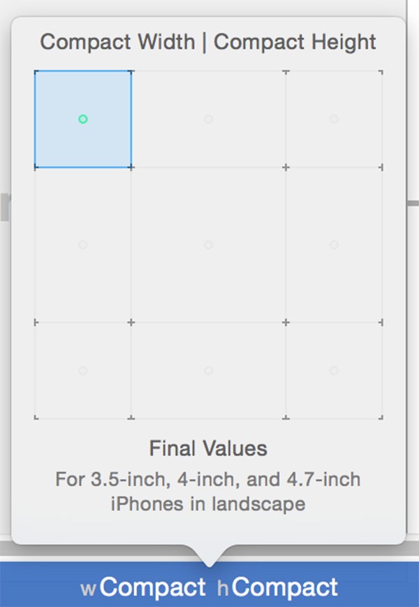
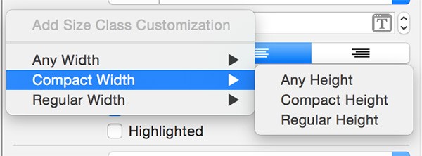
Open up Main.storyboard inside the project. You'll notice that the canvas is shaped like a rectangle. While jarring at first, this is actually displaying a core component of adaptive design. Looking towards the bottom of interface builder, you'll notice a button that says wAny hAny.
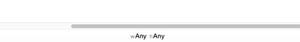
This stands for Any Width, Any Height, which is indicating that any changes to the user interface here apply to every size class. If you click the button, a grid appears that allows you to toggle between different size classes:
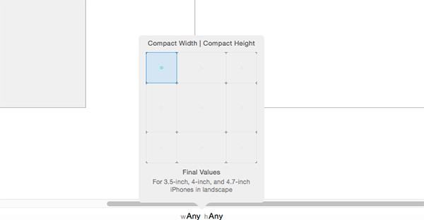
In the example above, Compact Width | Compact Height is selected and there is a green dot in the blue grid. The green dot shows which size classes are represented. In this case, changes only apply to 3.5, 4, and 4.7 inch iPhones in landscape.
Notice that there is a bit of a difference in the wording, as Interface Builder uses the terms width and height whereas size classes use the terms horizontal and vertical. Width corresponds to horizontal and height corresponds to vertical.
If you changed the currently selected size class, be sure to switch back to Any Width | Any Height.
Step 2: Adding an Image
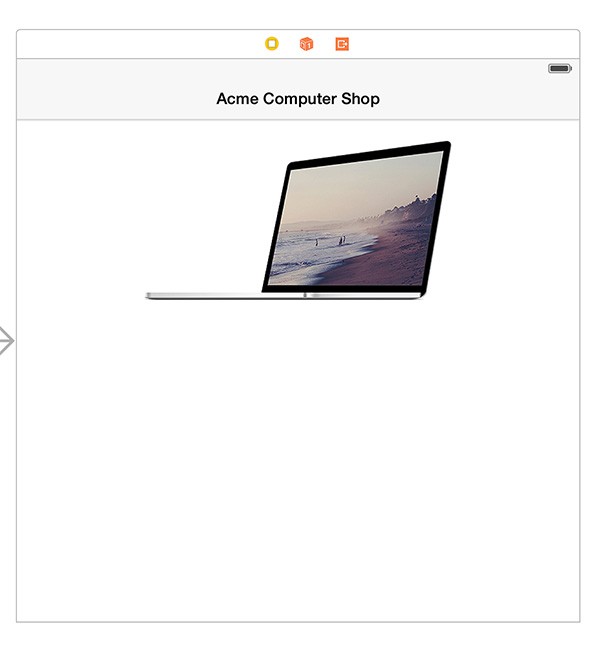
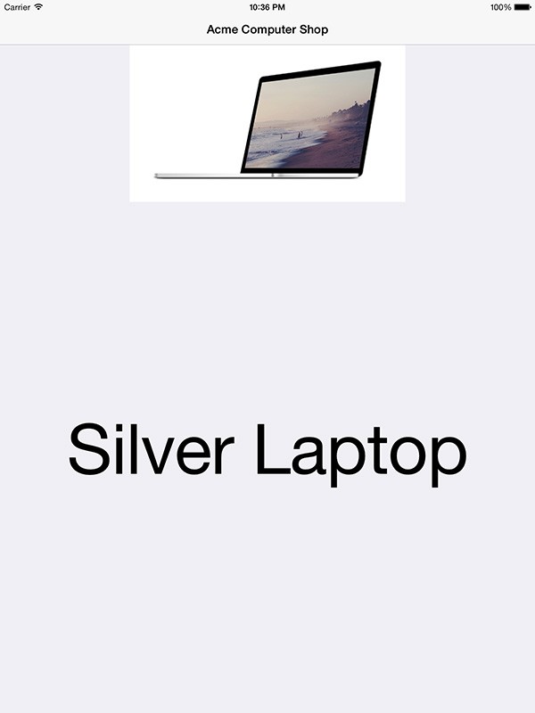
Drag an image view onto the view controller's canvas from the Object Library. Using the Size Inspector, set its X position to 0 points and its Y position to 72 points. Set the width to 600 points and the height to 218 points. Open the Attributes Inspector and change the view's mode to aspect fit and image to "Laptop". Your canvas should look like the image below:
Step 3: Adding a Label
Open up the Object Library once more and drag a label onto the canvas. Open up the Size Inspector and set the label's X position to 16 points and its Y position to 312 points. For the size, set its width to 568 points and its height to 242 points.
In the Attributes Inspector, make the following changes:
- set Text to "Silver Laptop"
- change Font Size to System 100.0 points
- set Alignment to Center
- set Lines to 0
Step 4: Adding Constraints
Now we'll add constraints for the label and the image view. At the bottom of Interface Builder, click Reset to Suggested Constraints under the All Views in View Controller section. If the option is greyed out, then make sure one of the views in the canvas is selected.
Since the image view has the same white background as its containing view, we'll change the view's background color to make it easy to differentiate between the two. Select View from the document outline and change its background color to Group Table View Background Color.
Step 5: Build and Run
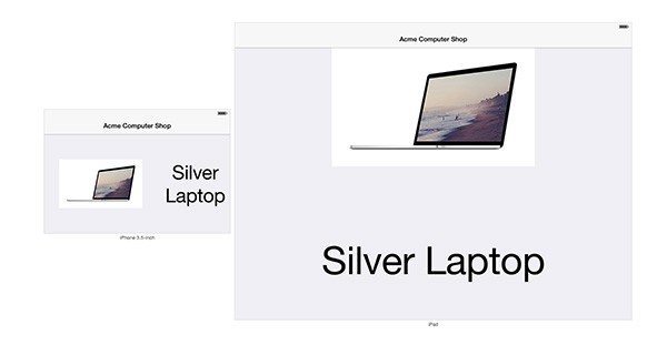
At the top of Xcode, select iPad Retina to use for the iOS Simulator. Build and run the app by pressing Command + R. The app seems to look fine for the iPad, but we want to ensure it displays properly on every device.
3. Live Preview
Building and running your app just to see how your user interface behaves can be a tedious task. Luckily, Xcode 6 has added the ability to get a live rendering of your user interface on any device in any orientation. This helps us resolve any auto layout issues much faster than running the app in the iOS Simulator every time.
Step 1: Enabling Preview Assistant
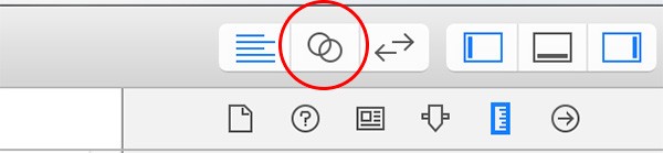
At the top of Xcode, click the Assistant Editor button.
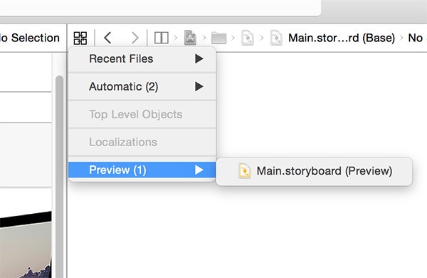
This splits Xcode's editor in two panes. In the right pane, select Automatic > Preview > Main.storyboard in the jump bar.
Step 2: Adding Devices to Preview
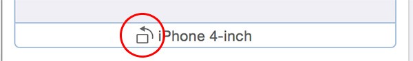
Interface Builder now shows a live preview of the user interface on a 4 inch iPhone. As expected, the user interface is less than ideal on the iPhone. If you aren't seeing anything on the preview, then click the view controller in the left pane to refresh it.
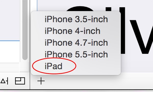
In the right pane, clicking the + button at the bottom lets you add more devices to preview. Go ahead and add the iPad to preview as well.
Step 3: Switching Orientations
Hover over the iPhone in the assistant editor towards the bottom. To the left of the name of the device, there is a button that switches the current orientation. Click it once to switch the iPhone preview to landscape orientation.
With the orientation in landscape, the user interface looks even worse. The image view isn't showing at all and the label's text is far too big.
4. Installing Size Class Specific Constraints
To fix the user interface, we'll add some constraints that are specific to a certain size class. This is another advantage of adaptive design. We can to tell the user interface how it should lay out its views for certain size classes, using the same storyboard. Before, this would usually require using two different storyboards and loading the correct one at runtime.
Step 1: Adding Image View Base Constraints
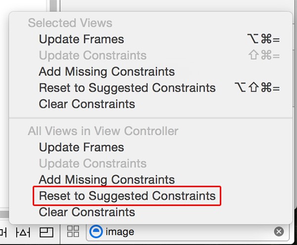
We'll first add constraints that should work for most devices and refine them from there. Start by removing the constraints added earlier by clicking any view in the canvas and selecting Editor > Resolve Auto Layout Issues > All Views in View Controller - Clear Constraints.
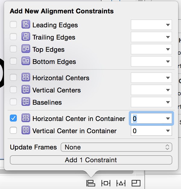
Select the image view, click the Align button, choose Horizontal Center in Container, and click Add 1 Constraint.
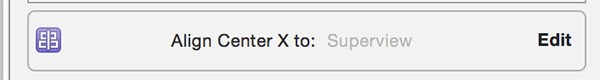
Open the constraint we just added in the Size Inspector on the right and double-click it to edit it.
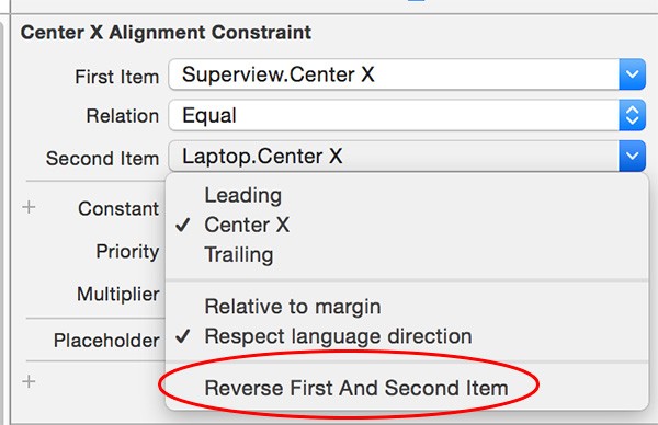
The constraint has the superview's center equal to the image view's center, but we want the opposite. Click Second Item and choose Reverse First And Second Item to correct the issue.
Next, press Control and drag from the image view to View inside the document outline on the left, and select Equal Heights. Select the constraint in the Size Inspector and change the constraint's multiplier to 0.4. This will force the image view's height to be equal either the superview's height or at least 40 percent of it—whichever ends up being shorter.
Next, click the Pin button and choose the top and bottom spacing to nearest neighbor. For the bottom spacing, enter 18 points. The top spacing should already be set to 0 points. Make sure Constrain to margins is unchecked since we don't want padding around the view. Click Add 2 Constraints at the bottom to add the constraints.
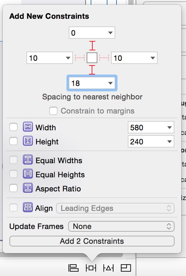
Double-click the Bottom Space constraint in the Size Inspector to edit it. Change the Relation to Greater Than or Equal. To finish up the image view's constraints, Control and drag from the image view to the label and choose Equal Heights.
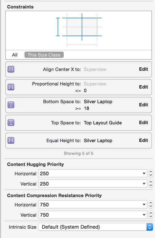
The constraints for the image view should look like this:
Step 2: Adding Label Base Constraints
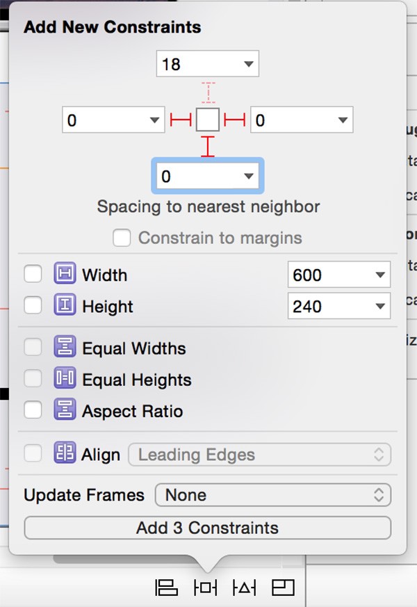
Due to the constraints added to the image view, the label already has its height and vertical spacing from the image view added. Select the label and click the Pin button to add a leading, trailing, and vertical spacing constraint as shown in the image below.
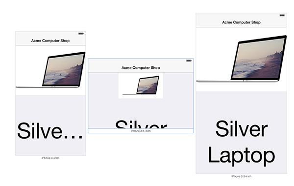
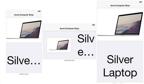
If you preview the app now in the assistant editor, the constraints have made things much better. However, there's still a problem when the app is using the compact horizontal size class as you can see below (middle).
In this case, it would be nice to have the image view and label side by side instead of on top of one another.
Step 3: Adding Compact Horizontal Constraints
Using the size class toggle button at the bottom, select Compact Width | Compact Height. The bar turns into a shade of blue to indicate you are now editing the user interface for a specific size class.
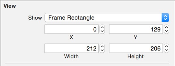
Select the image view, open the Size Inspector, and update its frame as shown in the image below.
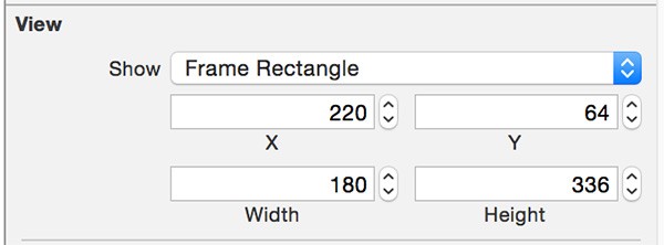
Next, select the label and update its frame in the Size Inspector as shown below.
With the label still selected and the Size Inspector open, select the label's constraints and remove them by pressing Delete. You can select multiple constraints by holding down the Shift key. This will remove the constraints we've added so far, but only for this size class.
Do the same for the image view by selecting it, opening the Size Inspector, selecting its constraints, and pressing Delete. We can now add constraints to ensure the image view and label are positioned side by side.
Fortunately, Xcode can easily figure these constraints out for us. With either the image view or the label selected, choose Editor > Resolve Auto Layout Issues > All Views in View Controller - Reset to Suggested Constraints.
Step 5: Preview Updated Constraints
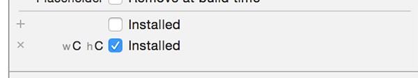
Open the Size Inspector for the image view. You'll see that there are several constraints listed, but some are greyed out and some aren't. This indicates which constraints are active for the current size class.
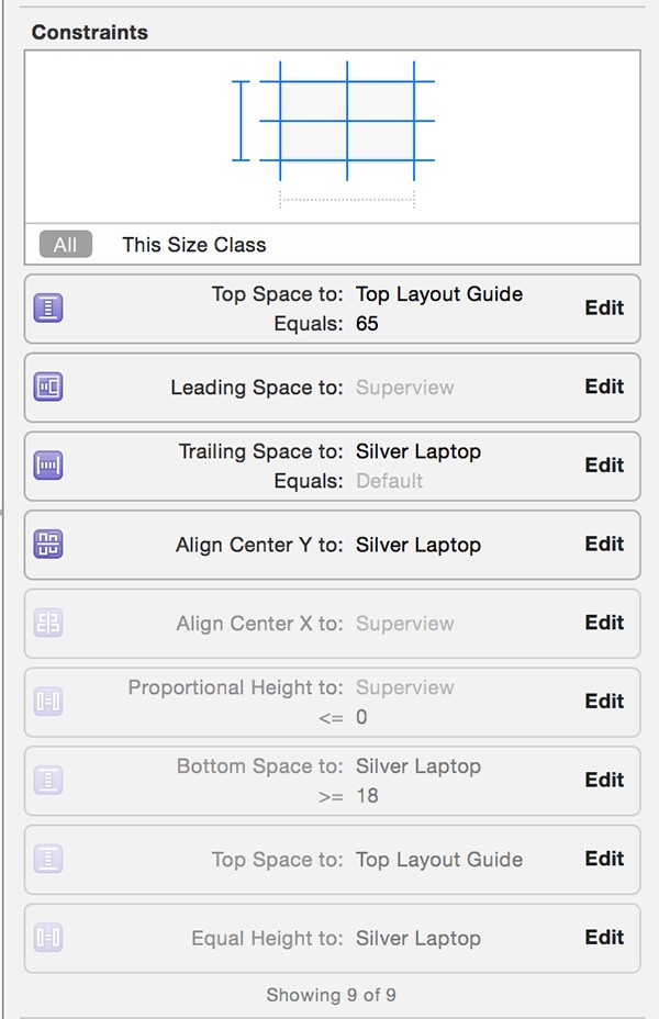
If you double-click on any of them, the bottom section shows us which size classes the constraints are active for. The image below shows that the constraint is installed for Compact Width | Compact Height and disabled for Regular Width | Regular Height. Clicking the x or + button enables or disables the constraint for the given size class.
Open the preview assistant editor again and add a 3.5 inch iPhone in landscape mode if there isn't one already. We can see we've achieved an entirely different layout for certain devices in landscape orientation - all in one storyboard.
5. Dynamic Text
The last thing to address is the font size. While the actual frames of the image view and label are working out nicely, the font can sometimes become truncated. Adaptive design has added new options for developers to handle this type of scenario.
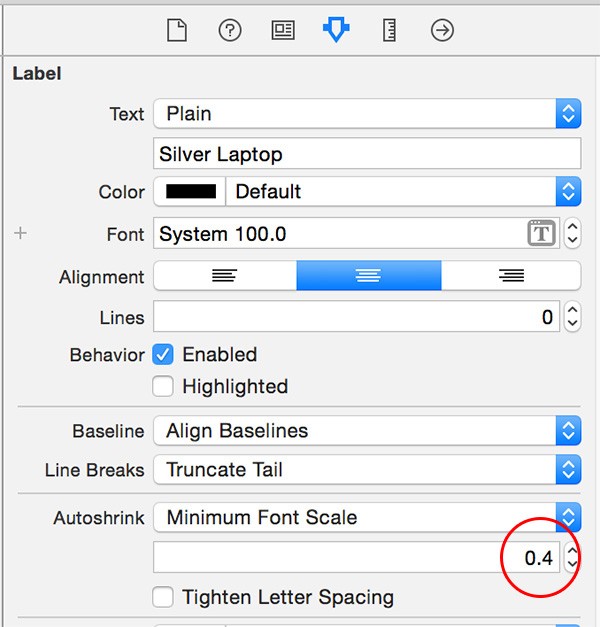
Step 1: Edit the Font Scale
Select the label and open the Attributes Inspector on the right. Under Autoshrink, select Minimum Font Scale and set it to 0.4.
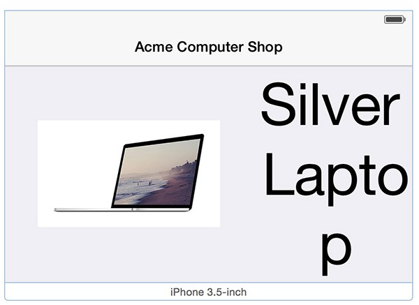
Step 2: Adding Size Class Specific Fonts
Editing the font scale will be sufficient for most cases. In our app, though, the label's contents is readable for the Compact Width | Compact Height size class, but it's not ideal. If you open the preview assistant editor, you'll notice the "p" in the word "laptop" is on its own line.
With the label selected, click the + button next to Font in the Attributes Inspector. This opens a menu to select a size class to apply a particular font to. Choose Compact Width | Compact Height.
Similar to size class specific constraints, a font has been added for the size class we selected. Change the font size to 50 points. Now, open the preview assistant editor one more time and verify the font looks perfect on every device.
The ability to add adaptive fonts is incredibly powerful. Localizing apps is trivial when you are able to control font size more precisely with dynamic text.
6. Other Adaptive Design Technologies
While size classes are certainly a premier feature, there are many other adaptive design APIs and advancements that I haven't covered in this tutorial. For example, view controllers now conform to the UITraitEnvironment protocol. This means that view controllers have a traitCollection property that keeps track of what size class is currently displayed.
If you enjoy creating user interfaces in code, the traitCollection property gives you the same capabilities as size classes do in Interface Builder. You can be notified when the size class changes and perform any necessary updates to your constraints or user interface.
Another helpful API is the UIPopoverController. If you've previously developed a universal app, I'm sure you've seen code like this:
UIViewController *contentVC = //content

if([[UIDevice currentDevice] userInterfaceIdiom] == UIUserInterfaceIdiomPad)
{
    UIPopoverController *popVC = [[UIPopoverController alloc]
initWithContentViewController:contentVC];

    [popVC presentPopoverFromBarButtonItem:item
permittedArrowDirections:UIPopoverArrowDirectionAny animated:YES];
}
else
{
    [self presentViewController:contentVC animated:YES completion:nil];
}
As of iOS 8, there's no longer a need to check which device the app is running on when using the UIPopoverController class. The UIPopoverController class now also supports iPhone and iPod Touch.
As far as image assets, notice that there is now a @3x size. This is due to the Retina HD display found on the iPhone 6 Plus. If you open the Images.xcassets file in the project, you'll see it under any of the supplied image sets.
Conclusion
Adaptive design is probably the most important change in iOS development in several years. Prior to adaptive design, universal apps were not easily developed and scalability in such projects could be an issue. Hopefully you've learned enough from this tutorial to avoid those problems and incorporate adaptive design into your own apps.

Comments