Everyone deals with data and very often it is presented in large data tables. Representing and reading through long tables on a website can be very cumbersome. Charts are good for letting people understand the change and tendency behind data.
Recently, when I was trying to find an easy way to insert an interactive chart on a website, I found Highcharts and I have been using it in various projects ever since.
Throughout this series of articles, we're going to take a survey of Highcharts, why it's great, and how we can implement it in our own web-based projects.
What Is Fascinating About Highcharts?
- It's interactive. You can mouse over an item for more details and you can also click on items in the chart legend to turn them on and off.
-
Compatibility. It's based on JavaScript, it renders in a web browser, so even IE 6 or an iPad can show you those beautiful charts. Highcharts utilizes other JS frameworks such as jQuery, MooTools, Prototype or Highcharts Standalone framework. You need one of the libraries and
highcart.jsto create charts. - Many-many chart types. Highcharts supports line, spline, area, areaspline, column, bar, pie, scatter, angular gauges, arearange, areasplinerange, columnrange and polar chart types. We'll see examples for the most commonly used ones: column, bar, line and pie charts.
- Feeding Highcharts is easy. Highcharts can load data from local data, local files or even from a remote server. It can take parsed data from CSV, JSON, XML files or any other database.
- Save or print your charts. One of the surprising feature I found is that you can print or export the chart you currently see. One can save a chart as PDF, JPG, PNG or SVG file.
- Easy to set up, tuning is not a problem. Add a few lines of code and your data and charts will draw. With its well written user documentation and API reference, beginners won't get lost and experienced developers are welcome.
- Flexible license. Using Highcharts is free for non-commercial sites and prices are flexible for commercial projects.
- Theme-able. At the moment, there are four predefined modern-looking themes or you can make your very unique one with some taste and CSS-knowledge.
Before using Highcharts the first time, let's see which chart type to use in common tasks.
Which Chart to Use When?
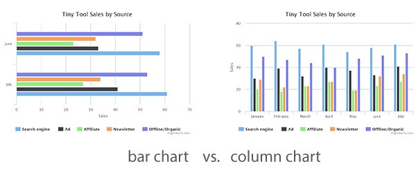
Bar charts and column charts are similar in a way that each uses long rectangles to compare multiple values, but their difference lies in the orientation of their graph. Bar charts are horizontally oriented and column charts are vertical.
In my simple example, I compare an imaginary web shop's sales by source in a monthly distribution (comparing each month's sale with each other). As you can see below, if you want to compare only a small amount of data, and the bar chart fits on the screen with which you're currently working, then your best bet is to go with the bar chart.
In contrast, you should use column charts if you have vertical limitation such as with landscape-oriented screens. See comparison below.
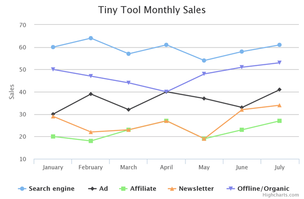
Line charts represent information with the series of data points and straight lines. They show particular data changes at equal intervals of time. It is often used to visualize trend in a time series.
In my example, I use the same data table as I used below to compare multiple data sets. As you can see, it is easy to compare the sales source trending of the previous months.
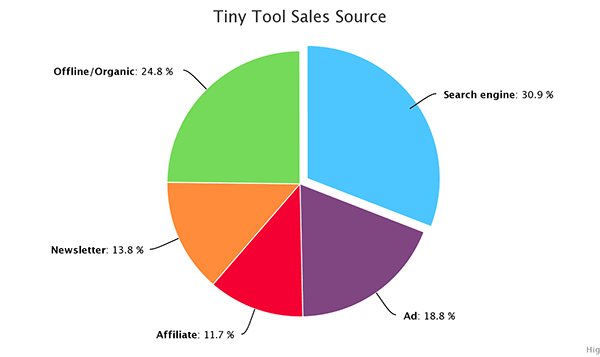
Pie charts are circular charts divided into sectors where each sector shows the relative size of each value. They are useful when you want to compare data which are part of the whole. Each pie slice represents its numerical value of the sum.
In my example, I show the distribution of different source type sales of a given period.
Anatomy of Highcharts
In order to understand the following code examples, you need to know the basic concepts that make up Highcharts.
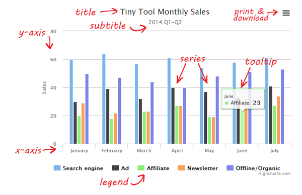
These are the primarily parts of a chart:
- Title displays the name of a chart on top
- Subtitles are placed right under the title
- Series refers to one or more data series presented on a chart
- Tooltips are descriptions of particular data displayed by hovering over part of a chart
- Legend displays the name and/or the symbol of each series on a chart. By clicking on the name of the series in a legend, one can enable or disable the series.
- Print and download let's users print or export the chart.
Adding Your First Chart
In this example, we import some sample data from a CSV-file, process it, and present the data in a column chart within a HTML file.
Let's see the basic setup:
- You need to create an HTML file with any name you want
- In the same directory you need a CSV (comma-separated values) file
In my example, I use a text file where values are separated by comma and records are separated by new lines.
The content of the column-data.csv file that we're using:
Sales by source,January,February,March,April,May,June,July
Search engine,60,64,57,61,54,58,61
Ad,30,39,32,40,37,33,41
Affiliate,20,18,23,27,19,23,27
Newsletter,29,22,23,27,19,32,34
Offline/Organic,50,47,44,40,48,51,53
In the HTML's head, we need to include the latest version of jQuery, Highcarts.js, the optional export module, and our custom JavaScript that prepares and creates our chart.
In the body, we need a container div where the chart can be drawn.
<!DOCTYPE html>
<html>
<head>
    	<meta http-equiv="Content-Type" content="text/html; charset=utf-8">
		<title>My first column chart by Highcharts</title>
		<!-- 1. Add JQuery and Highcharts in the head of your page -->
		<script type="text/javascript" src="http://ajax.googleapis.com/ajax/libs/jquery/1.10.1/jquery.min.js"></script>
		<script src="http://code.highcharts.com/highcharts.js"></script>

        <!-- 2. You can add print and export feature by adding this line -->
		<script src="http://code.highcharts.com/modules/exporting.js"></script>


		<!-- 3. Add the JavaScript with the Highchart options to initialize the chart -->
		<script type="text/javascript">
		jQuery(document).ready(function() {

			var options = {
				chart: {
					renderTo: 'container',
					type: 'column'
				},
				title: {
					text: 'Tiny Tool Monthly Sales'
				},
				subtitle: {
					text: '2014 Q1-Q2'
				},
				xAxis: {
					categories: []
				},
				yAxis: {
					title: {
						text: 'Sales'
					}
				},
				series: []
			};
			// JQuery function to process the csv data
			$.get('column-data.csv', function(data) {
				// Split the lines
				var lines = data.split('\n');
				$.each(lines, function(lineNo, line) {
					var items = line.split(',');

					// header line contains names of categories
					if (lineNo == 0) {
						$.each(items, function(itemNo, item) {
							//skip first item of first line
							if (itemNo > 0) options.xAxis.categories.push(item);
						});
					}

					// the rest of the lines contain data with their name in the first position
					else {
						var series = {
							data: []
						};
						$.each(items, function(itemNo, item) {
							if (itemNo == 0) {
								series.name = item;
							} else {
								series.data.push(parseFloat(item));
							}
						});

						options.series.push(series);

					}

				});
				//putting all together and create the chart
				var chart = new Highcharts.Chart(options);
			});

		});
		</script>

	</head>
	<body>

		<!-- 3. Add the container -->
		<div id="container" style="width: 600px; height: 400px; margin: 0 auto"></div>

	</body>
</html>
As you can see, the first things to set are the type of chart and the container's name. Then we set title, subtitle, and the title of the y-axis with our custom text. The content of the categories for the x-axis and the series data are processed and associated later after successfully parsing the CSV data.
Our JavaScript did these simple steps:
- Set the options
- Parse the CSV
- Created the chart
It's three simple steps to a really good looking chart for our data.
Coming Up Next...
This was an introductory article for how to begin using Highcharts.
In the next article, we're going to continue looking at the library and how we can use it to render information in other types of charts, as well.

Comments