If your app deals with a lot of data, using charts instead of tables to display that data could lead to a vastly better user experience. In this tutorial, you are going to learn about a popular open source charting library MPAndroidChart. The charts of this library are highly customizable, interactive, and easy to create.
Prerequisites
Make sure that you have the latest version of Android Studio installed. You can get it from the Android Developer website.
1. Adding MPAndroidChart to a Project
To use this library in your Android project, all you have to do is:
- Download the latest version of the library from Github. At the time of writing, the latest version is 1.7.4.
- Copy mpandroidchartlibrary-1-7-4.jar to your project's libs directory.
- In Android Studio, right click the JAR file and select Add as Library.
2. Creating a DataSet
All data should be converted into a DataSet object before it can be used by a chart. Different types of charts use different subclasses of the DataSet class. For example, a BarChart uses a BarDataSet instance. Similarly, a PieChart uses a PieDataSet instance.
Instead of simply dealing with random numbers to generate a sample chart, let's consider a hypothetical scenario. Alice and Bob are friends. Alice calls Bob several times a month to know what he's up to. Bob makes a note whenever she calls him.
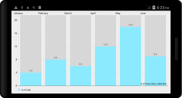
In this tutorial, we use Bob's notes to create a chart to show the number of times Alice called Bob. Here's what Bob has noted down:
| Month |
Number of Calls |
|---|---|
| January | 4 |
| February | 8 |
| March | 6 |
| April | 12 |
| May | 18 |
| June | 9 |
A bar chart seems perfect for this type of data. To display the data in a chart, we need to create a BarDataSet instance. You can follow the same steps to create instances of other subclasses of DataSet.
Every individual value of the raw data should be represented as an Entry. An ArrayList of such Entry objects is used to create a DataSet. Let's create a few BarEntry objects and add them to an ArrayList:
ArrayList<BarEntry> entries = new ArrayList<>();
entries.add(new BarEntry(4f, 0));
entries.add(new BarEntry(8f, 1));
entries.add(new BarEntry(6f, 2));
entries.add(new BarEntry(12f, 3));
entries.add(new BarEntry(18f, 4));
entries.add(new BarEntry(9f, 5));
Now that the ArrayList of Entry objects is ready, we can create a DataSet out of it:
BarDataSet dataset = new BarDataSet(entries, "# of Calls");
3. Defining the X-Axis Labels
We've already added several values to our chart, but they won't make much sense to the user unless we give them meaningful labels. Each x-axis label is represented using a String and an ArrayList is used to store all the labels.
ArrayList<String> labels = new ArrayList<String>();
labels.add("January");
labels.add("February");
labels.add("March");
labels.add("April");
labels.add("May");
labels.add("June");
4. Creating a Chart
All charts of this library are subclasses of ViewGroup, which means that you can easily add them to any layout. You can define your chart using an XML file or Java code. If the chart is going to take up the entire screen of an Activity or Fragment, then using Java code is easier:
BarChart chart = new BarChart(context);
setContentView(chart);
This creates a blank chart without any data. Let's use the data set and list of labels we created in the previous steps to define this chart's data.
BarData data = new BarData(labels, dataset);
chart.setData(data);
Let's also add a description to the chart.
chart.setDescription("# of times Alice called Bob");
If you now run your app on an Android device, you should be able to see a bar chart that looks similar to the one shown below. The chart is interactive and responds to pinch-to-zoom and dragging gestures.
5. Using Color Templates
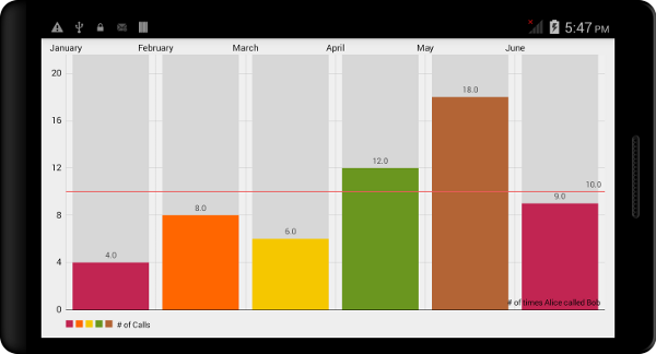
If you do not like the default colors, you can use the DataSet class's setColors method to change the color scheme. However, MPAndroidChart also comes with a number of predefined color templates that let you change the look and feel of your data set without having to deal with the individual color values.
In the current version of this library, the following templates are available:
ColorTemplate.LIBERTY_COLORSColorTemplate.COLORFUL_COLORSColorTemplate.JOYFUL_COLORSColorTemplate.PASTEL_COLORS-
ColorTemplate.VORDIPLOM_COLORS
To associate a color template with a data set, you have to use the setColors method. Here's an example:
dataset.setColors(ColorTemplate.COLORFUL_COLORS);
Run your app one more time to see a chart with more vibrant colors.

6. Adding Animations
All charts of this library support animations, which you can use to make your charts appear more lively. The animateXY method is used to animate both axes of the chart. If you want to animate only one of the axes, you can use animateX or animateY to animate the x-axis or y-axis respectively. You have to specify the duration (in milliseconds) of the animation when you call these methods. For example, to only animate the y-Axis, add the following code snippet:
chart.animateY(5000);
7. Using Limit Lines
You can add limit lines to a chart to add more meaning to your charts. Limit lines only make sense for certain types of charts, such as bar charts, line charts, and scatter charts.
In our example, where Alice calls Bob several times a month, let's say that Bob gets annoyed if Alice calls him more than ten times per month. To show this information, we could add a limit line for that value. Here's how you do this:
LimitLine line = new LimitLine(10f);
data.addLimitLine(line);
8. Saving the Chart as an Image
MPAndroidChart also enables you to save the current state of a chart as an image. To use this feature, you first need to give your app the permission to write to the device's SD Card. You can do this by adding the following code to your AndroidManifest.xml:
<uses-permission android:name="android.permission.WRITE_EXTERNAL_STORAGE"/>
You have two methods to choose from:
-
saveToGalleryThis method saves your chart as a JPEG file. It also lets you specify the quality or the compression ratio of the image. -
saveToPathThis method saves your chart as a PNG file to the path you specify.
For example, to save your chart as a JPEG file, you could use the following code snippet:
chart.saveToGallery("mychart.jpg", 85); // 85 is the quality of the image
Conclusion
In this tutorial, you learned how to use the MPAndroidChart library to create charts that are both pleasing and interactive. For the sake of consistency, I have used bar charts throughout this tutorial. However, you can follow the same steps to create other types of charts. To learn more about this library, I encourage you to read the documentation and examples on Github.

Comments