This is the last principle we'll look at. Broadly speaking it states that the content and the navigation of the site must be understandable. While the responsibility of implementing a lot of these recommendations lies with the plugin or theme's 'end user' (or whoever is publishing the content), there are recommendations that the developers of those plugins and themes can implement.
Readable (3.1)
The first guideline states that content should be "readable and understandable". A lot of recommendations relate to the reading level of the content, and the use of unusual words, abbreviations and acronyms, none of which are relevant to developers.
One recommendation we can implement is that the human language of the web page should be able to be programmatically identified. To achieve this, the language should be specified on the <html> element, via the lang attribute. Additionally the dir attribute should be used to indicate if the content is right-to-left.
WordPress makes this easy by providing language_attributes(), which prints the required attributes. In the header.php of your theme:
<html <?php language_attributes(); ?>>
The language_attributes() function sets the site's language and, if necessary, direction, and filters the output, allowing plugins (for instance, multilingual plugins) to change the attribute as appropriate.
Predictable (3.2)
The second guideline states that a web site should be presented, and behave, in a predictable manner. A lot of the recommendations can be fulfilled by ensuring the HTML mark-up of the theme is well structured and logical. Coupled with that are numerous "don't do"s—recommendations against making changes which disrupt the natural and logical behaviour of a web page.
Focus Behaviour
We mentioned not using tabindex in the fourth article of this series ("Operable"). This recommendation builds upon that to state that when an item receives focus, that should not be deemed a trigger for some change of the page's state.
For instance, a form button receiving focus should not cause that form to submit, and a link receiving focus should not cause that link to be activated. This is not to say that tooltips or, in the case of navigation menus, sub-menus should not appear when the appropriate item receives focus. Those examples don't constitute a change of state. Loosely speaking you can equate the ideas of an item receiving focus and an item being hovered over.
Don't Prevent Focus
You should avoid removing focus from an element which receives it. For example, you should never do something like the following:
$('a').on('focus',function(){ $(this).blur(); });
Aid Users When User Input Is Required (3.3)
Ensure Errors Are Identified
By default the only forms that are relevant to theme developers are the log-in/registration, search and comment forms. Of these, only the latter two are typically given any attention by the theme developer. Since search forms don't ever result in an 'error', we focus in this section on comment forms.
WordPress does a very good job of notifying users of an error, and informing them exactly what that error is. However, it does this by allowing users to leave the original page, and presenting them with a 'dead end' error page.
If users return to the original page, the form will have lost focus, and they will have to find it again. A better solution would be to prevent users from submitting the form until they have correctly filled out the form. However, when doing this it is essential to convey to users that the entered value is not valid, otherwise you will have essentially trapped them.
There are plenty of client-side validation scripts available, and it's also very easy to build your own simple validation script. What's important is:
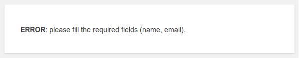
- The error message(s) that appear after the user leaves a field with an invalid value (or attempts to submit the form) should convey both that there is an error, and where this error is (i.e. identify the field).
- The error messages should be identified as alerts using the ARIA attribute:
role="alert". - Where appropriate, error messages should be as explicit as possible in informing the user why the entered value was not accepted.
Here's a simple example, based on WebAIM's own example of accessible form-validation, (which I encourage you to read), which adds an error message if the name field is empty.
    jQuery(document).ready(function($) {

		$('#author').on( 'blur', function( e ){
			var value = $(this).val();
			if( !value ){
				if( $('#author-error').length > 0 ){
					$('#author-error').remove();
				}

				$( '<p id="author-error" class="alert alert-error" role="alert"></p>' )
					.insertAfter( $('#author') )
					.text( 'Name field error: Please provide a name' );

			}else if( $('#author-error').length > 0 ){
				$('#author-error').remove();
			}

		});

	});
The WebAIM example also prevents users from leaving the field invalid, and returns them to the field to correct the mistake. If you do that, I'd recommend you don't return the user to the field if the value is empty, otherwise you will frustrate users who have accidentally given the field focus, but have no intention of submitting the form.
As noted previously in this series, you should not rely on colour or position alone to convey meaning. In this context, error messages should be obviously so from the text, as should the field(s) to which they relate.
Provide Labels
Themes should only be using comment_form() for displaying the comment forms, and this handles labels in an accessible manner. Equally the default search form, too, needs no further work. However, in customising or styling these forms you should:
Ensure the Labels Are Always Visible
Labels must be visible at all times. Specifically this means that placeholders do not constitute a label, and should not be used as search. There are several reasons for this:
- There is inconsistent support for screen readers.
- Placeholders are typically in a muted colour and may be hard to read.
- Since the placeholder disappears when the field gains focus, it can create usability problems for those with cognitive impairments.
Where Appropriate, Provide Further Instructions
If a form field requires further instructions, these can be provided after the field but still explicitly linked to it by using the aria-describedby attribute. The content of the element referenced by this attribute is read out after the label of field.
As an example from the W3C website:
<form>

    <label for="fname">First name</label>
    <input name="" type="text" id="fname" aria-describedby="fname-description">

    <p id="fname-description">A bit of instructions for this field linked with aria-describedby. </p>

</form>
However, you should be aware that there is inconsistent support for this amongst screen readers.
Identify Required Fields
Fields that are required should be marked as such with the aria-required="true" attribute. The default WordPress comment form as produced by comment_form() already handles this, so there is no action you need to take here. However, you should be aware of this should you choose to customise the comment forms.
Conclusion
This article concludes our rough theme developer guide to the W3C accessibility principles, and how they can be implemented. In the last article in this series we'll be looking at a few simple ways to go even further, and actively encourage and help the end user of our theme (or plugin) to produce accessible content.

Comments