In this article, we're going to take a look at how to use Sass and Compass in our WordPress theme development process. We will structure our theme stylesheets in SMACSS fashion and will leverage the power of Compass to generate image sprites for both retina and non-retina devices.
Note that this article is not an introduction to Sass; however, if you are a beginner, still feel free to follow along.
Requirements
Before we jump in, make sure that you have Sass and Compass installed on your machine. If you haven't installed them yet, follow the instructions on:
There are few GUI based Sass and Compass applications, but I will be using the Terminal (if you're on Windows, then you can use the Command Prompt). Feel free to use the tool with which you are most comfortable.
Project Setup
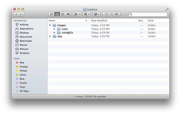
Let's start by creating a folder for our project. Create a new folder on your Desktop and call it tutsplus. Inside it create two new folders: sass and images. The sass folder will contain our Sass files that will form our theme stylesheet, the style.css.
Open the images folder and create two new directories for our theme icons. Call the directories icons and icons@2x. Later, we will use the images in these folders to create a image sprites for our theme. At this point your folders structure should look the following:
Compass Configuration
We will use Compass to watch for file changes inside the sass folder and, when a change occurs, it will use the Sass to compile our stylesheets. Every time we launch Compass, it will look for a configuration file in the current directory. That file is called config.rb.
To create the configuration file open your terminal/command prompt and navigate to your tutsplus folder on your desktop:
cd /Desktop/tutsplus/
Next call the compass config config.rb command. This command fill generate the configuration file for you. Open the file in your favorite text editor and make the following changes:
- Chage the
css_dir = "stylesheets"to:css_dir = "/". This will tell the Compass to output the generated CSS files inside our theme root folder, as this is where the WordPress will look for our theme'sstyle.css. - Set your prefered output style for the generated CSS. Here, I will set it to expanded style by typing on line 12
output_style = :expanded.
- Uncomment lines 14 and 17 by deleting the preceding hash symbol so that the following lines look like
relative_assets = trueandline_comments = false.
Save your changes. Now your config.rb file should look like the one below:
# Require any additional compass plugins here.

# Set this to the root of your project when deployed:
http_path = "/"
css_dir = "/"
sass_dir = "sass"
images_dir = "images"
javascripts_dir = "javascripts"

# You can select your preferred output style here (can be overridden via the command line):
# output_style = :expanded or :nested or :compact or :compressed
output_style = :expanded

# To enable relative paths to assets via compass helper functions. Uncomment:
relative_assets = true

# To disable debugging comments that display the original location of your selectors. Uncomment:
line_comments = false

# If you prefer the indented syntax, you might want to regenerate this
# project again passing --syntax sass, or you can uncomment this:
# preferred_syntax = :sass
# and then run:
# sass-convert -R --from scss --to sass sass scss && rm -rf sass && mv scss sass
Watch For Changes
All right! Now that we have the configuration file, it is the time to create our first Sass file. Create new file inside the sass folder and call it style.scss. Next, launch your Terminal and navigate to the /Desktop/tutsplus/ directory.
Execute the compass watch command. This command will start a process that will continuously look for Sass files changes inside our sass folder. It will find our style.scss file and output its CSS representation as style.css inside our tutsplus directory.
Note that all files inside our sass folder that names does not start with underscore will be processed and outputed in the tutsplus folder. This is exactly what we want for the style.scss file.
An important thing to remember: Don't make direct changes inside the generated CSS files, as your changes will be lost once you compile again your Sass files.
Decompose
We are going to separate our style.scss into small components using the style guides defined in SMACSS (Scalable and Modular Architecture for CSS). The author of SMACSS is Jonathan Snook and he has published a book about this very topic that I encourage you to read. If you are a Tuts+ member, you can download a copy of it from here.
SMACSS categorizes your CSS rules into five groups:
- Base
- Layout
- Module
- State
- Theme
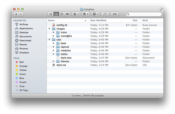
Let's create a folder for each of those categories inside our sass folder. Use the following names: base, layouts, modules, states and themes.
Base
In your base folder, put all of your stylesheets that conform to the SMACSS Base Style Rules. Those stylesheets should apply styles only on element selectors. This is also a good place to put your browser reset CSS.
Compass comes with browser reset based on Eric Meyer's reset stylesheet. For this project, I'm going to use normalize.css. Download the normalize.css file and place it inside the base directory, then rename it to _normalize.scss. Make sure to change its file extension from css to scss.
Next, we need to import the normalize stylesheet in our style.scss. To do this open the style.scss and add:
// Base
@import "base/normalize";
As you can see we are omitting the underscore in the file name and its file extension. The Sass preprocessor is smart enought to import the file we wanted.
Layouts
Here, place your theme layout styles. For example, this will include your header, sidebar, footer and page layouts as _header.scss, _sidebar.scss, _footer.scss and _page.scss.
You can use the l- prefix for your layout class names:
// _header.scss
.l-main-header {
    margin: 30px;
    padding: 20px;
    font-size: 16px;
}

// _navigation.scss
.l-main-nav {
    position: relative;
}
This is also a good place for your grid stylesheet. You can read more about SMACSS layout rules, as well.
Modules
Modules are reusable content elements. For example, a blog post is a module in that its rules are re-used on multiple instances of same module. Widgets, shortcodes, and icons are also a type of module.
A module can contain sub modules. Here is an example of widget module and its title submodule:
<li class="widget">
    <h4 class="widget__title">Recent Posts</h4>
</li>
.widget {
    padding: 10px;
}

.widget__title {
    font-size: 15px;
}
Here we are using the BEM (Block Element Modifier) class naming convention.
States
Place here your stylesheets that control the appearance of your elements depending on some state. If you are building a responsive theme place here your media queries stylesheet.
Let's create one right now.
Create a new file in your text editor and save it as _media_queries.scss in the /sass/states/ folder. Paste these common screen size rules inside of the file:
/*! =Media Queries
-------------------------------------------------------------- */

/* 956-768px */
@media only screen and (min-width: 768px) and (max-width: 959px) {

}

/* 767-480px */
@media only screen and (min-width: 480px) and (max-width: 767px) {

}

/* 479px */
@media only screen and (max-width: 479px) {

}
Don't forget to import our newly created stylesheet in our style.scss file:
// Base
@import "base/normalize";

// States
@import "states/media_queries"
If you have for example an off-screen navigation menu, here you can put the styles that will controll the appearance when your navigation .is-open or .is-closed, but in most cases you will put those in the layout or module file for the off-canvas navigation.
Themes
This is a good place to put your custom WordPress plugin's styles. For example, here you can put your custom styles for, say, the Contact Form 7 plugin.
Theme Info
Each WordPress theme's style.css file should contain meta information about the theme like theme name, author, version and more. We can take advantage of the Sass variables to change that information for each theme we create.
First create a new file called _vars.scss and save it inside the sass folder. In this file we will put all of our variables. If you find that this file grows too big, separate its content to smaller files.
Open the newly created file and enter the following variables:
// Theme Information
//--------------------------------------------//
$theme_name: "My Theme";
$theme_uri: "#";
$theme_description: "My WordPress Theme";
$theme_version: "1.0";
$theme_author: "my name";
$theme_author_uri: "#";
$theme_license: "GPL";
$theme_tags: "responsive-layout, post-formats";
Now we need to create a file that will use the above variables. Using your text editor of choice, create a new file called _theme_info.scss and save it in the sass folder. Fill the _theme_info.scss with the following content:
/*!

Theme Name: #{ $theme_name }
Theme URI: #{ $theme_uri }
Description: #{ $theme_description }
Version: #{ $theme_version }
Author: #{ $theme_author }
Author URI: #{ $theme_author_uri }
License: #{ $theme_license }
License URI: License.txt
Tags: #{ $theme_tags }

*/
The final step is to import our newly created files inside the style.scss, let's also import the Compass components:
@import "compass";

@import "vars";
@import "theme_info";

// Base
@import "base/normalize";

// States
@import "states/media_queries";
Now if you open the processed style.css file it will contain the WordPress theme information comment block with the variables values that you set in _vars.scss file.
Helpers
It is a good practice to use more small more generic CSS classes to style an element rather than using one too specific selector. Follow the DRY - Don't Repeat Yourself principle. We can create a stylesheet for our small helper classes. To give you an example, I will define some layout and typography helpers.
Create a new file called _helpers.scss and save it inside the sass folder. Again, as with the variables file, if your helper file get too big to maintain, consider splitting it into smaller files.
Open the newly created file and paste in:
/*! =Helpers
-------------------------------------------------------------- */

// Layout
//--------------------------------------------//
.left {
    float: left;
}

.right {
    float: right;
}

.clear {
    clear: both;
}

.hide {
    display: none;
}

.hidden {
    opacity: 0;
    visibility: hidden;
}

.clearfix {

    &:before,
    &:after {
        content: " ";
        display: table;
    }

    &:after {
        clear: both;
    }
}

.center-block {
    display: block;
    margin: 0 auto;
}

// Typography
//--------------------------------------------//
.f-normal {
    font-weight: normal;
}

.f-bold {
    font-weight: bold;
}

.f-italic {
    font-style: italic;
}

.t-strike {
    text-decoration: line-through;
}

.t-overline {
    text-decoration: overline;
}

.t-underline {
    text-decoration: underline;
}

.t-left {
    text-align: left;
}

.t-right {
    text-align: right;
}

.t-center {
    text-align: center;
}
As you can see here we are using f- prefix for font-related classes and t- for text-related classes. Save your file and import it inside the style.scss:
@import "compass";

@import "vars";
@import "theme_info";

// Base
@import "base/normalize";

// Helpers
@import "helpers";

// States
@import "states/media_queries";
Generating Sprites
Compass comes with handy methods for generating image sprites. We will place our icons inside our icons and icons@2x folders, where the latter will contain the same icons but in twice the size for devices with retina display.
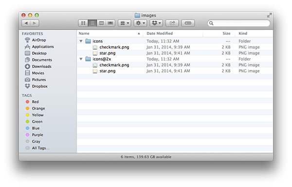
For this example, I will put inside two icon files: checkmark.png and star.png that you can find in the download package associated with this post.
For each icon we will generate a separate CSS class using a Sass list with all of the icon file names. Open the _vars.scss file and add the following code:
// Icons
//--------------------------------------------//
// map *.png icon files
$icons_sprite: sprite-map( "icons/*.png" );
$icons_sprite2x: sprite-map( "icons@2x/*.png" );

// generate the icons sprites
$sprites_file: sprite-url( $icons_sprite );
$sprites2x_file: sprties-url( $icons_sprite2x );

$sprites_url: url( "images/" + sprite-path( $icons_sprite ) );
$sprites2x_url: url( "images/" + sprite-path( $icons_sprite2x ) );

// list with theme icons file names (found in icons and icons@2x folders)
$theme_icons: ( "checkmark", "star" );
Compass will find all the *.png image files inside our icons folders and will generate two image sprites in the images folder. Now we want to generate CSS classes for those images.
To find the icon position inside the sprite image, we will create two helper mixins. To do that, create a new file and call it _mixins.scss then open it and paste in the following code:
// Icons
//--------------------------------------------//
@mixin sprite_icon( $name, $sprite ) {

    @include sprite-dimensions( $sprite, $name );
    background-position: sprite-position( $sprite, $name );
}

@mixin retina_sprite_icon( $name, $sprite ) {

    $pos: sprite-position( $sprite, $name );
    background-position: nth( $pos, 1 ) nth( $pos, 2 ) / 2;
    @include background-size( ceil( image-width( sprite-path( $sprite ) ) / 2 ) auto );
}
Both mixins are accepting an icon name plus a sprite map as arguments. Those mixins will set the width, height and the background position for the icon inside the generated image sprite. The retina_sprite_icon will also set the appropriate background size for the retina icons.
Now it's time to generate our icons classes. Create a new file called _icons.scss and save it inside the /sass/modules/ folder. Next, paste inside the following content:
/*! =Icons
-------------------------------------------------------------- */
@if ( length( $theme_icons ) > 0 ) {

    .icon {
        display: inline-block;
        background: $sprites_url no-repeat;
    }

    @each $icon in $theme_icons {

        .#{ "icon--" + $icon } {

            @include sprite_icon( $icon, $icons_sprite );
        }
    }

    @media
    only screen and (-webkit-min-device-pixel-ratio: 2),
    only screen and (   min--moz-device-pixel-ratio: 2),
    only screen and (     -o-min-device-pixel-ratio: 2/1),
    only screen and (        min-device-pixel-ratio: 2),
    only screen and (                min-resolution: 192dpi),
    only screen and (                min-resolution: 2dppx) {

        .icon {
            background: $sprites2x_url;
        }

        @each $icon in $theme_icons {

            .#{ "icon--" + $icon } {

                @include retina_sprite_icon( $icon, $icons_sprite2x );
            }
        }
    }

}
Here, we are looping through our icon names list which is identified by $theme_icons and generating both retina and non retina style rules using our icon mixins. From there, we generate a class called .icon that will be the base module for our icons and then the module modifiers classes for each icon in the list.
In this example, it will generate the .icon--checkmark and .icon--star classes. Here is an example usage of the star icon:
<i class="icon icon--star"></i>
Finally let's import our mixins and icons module inside the style.scss file:
@import "compass";

@import "vars";
@import "mixins";
@import "theme_info";

// Base
@import "base/normalize";

// Helpers
@import "helpers";

// Modules
@import "modules/icons";

// States
@import "states/media_queries";
Conclusion
Sass and Compass are both powerful utilities and can go a long way in improving your WordPress theme development and WordPress plugin development. This guide aims to set you on the road to creating a more refined process for working with WordPress.
For those who are curious and want to read more about some of the information covered in this tutorial, please review the following articles:

Comments